Contrast ratio

What is contrast ratio?

How clearly the foreground stands out against the background. In most cases, this is text against a block colour (white, blue, yellow etc) or, crucially, an image.

The contrast ratio regulations are in place to ensure people who are visually impaired can see content sufficiently well enough to consume it and benefit from it. A third of the UK population are short-sighted and three million people in Britain are colour blind.

Black text on a white background has a contrast ratio of 21:1. It’s as clear as it’s going to get. As you approach a contrast ratio of 1:1, it gets more and more difficult for people to distinguish the foreground text against the background.

The regulations state that normal text should have a contrast ratio of at least 4.5:1.

Large text (18pt or higher, or bold 14pt of higher) should have a contrast ratio of at least 3:1.

Active non-text objects (graphics you need to click on or graphs and charts) also need a contrast ratio of at least 3:1.

Contrast ratio solutions in T4

Almost all of the contrast ratio solutions for the website have been provided through its design.

The only issue that will concern you will be breadcrumbs (showing the user where they are on the website), header navigation links (COURSE SEARCH, STUDY etc) and content tags (eg CASE STUDY) that sit on top of a hero image. For example:

a heading and white links/breadcrumbs sitting over a hero image

Use preview, including mobile view, to check that your links/breadcrumbs stand out against the image.

You can change the colour of your links/breadcrumbs in the image hero: black links with blue breadcrumbs, all white or all black. You do this by choosing the “Scheme” in the image hero content type as default (black links with blue breadcrumbs), white or black. Use the style that stands out best against your image.

the Scheme drop-down in the image hero content type

Sometimes, no matter which scheme you choose, the links/breadcrumbs don’t stand out. You can check the exact contrast ratio using a tool such as Accessibility Insights for Windows (you will need IT support to download this).

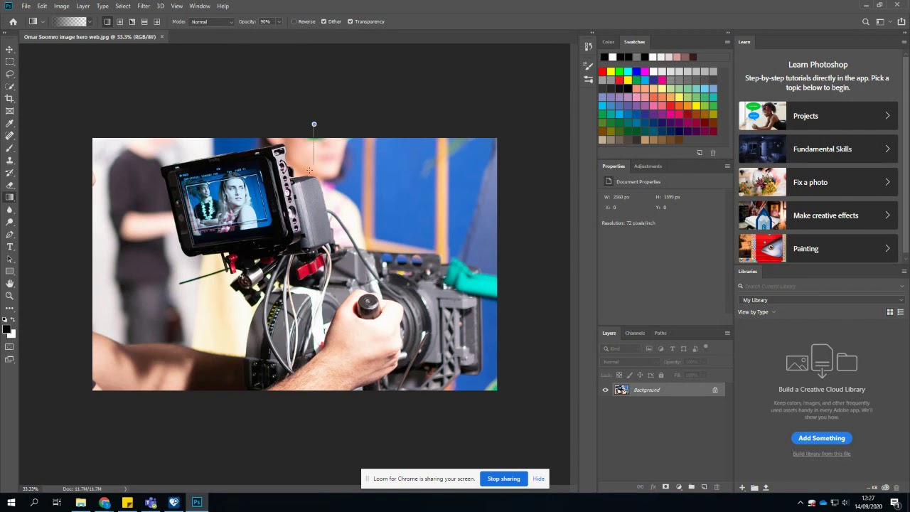
Your options now are to change your image for one with a background that helps your links/breadcrumbs stand out or to modify your image with a white or black fade in Photoshop to make the links/breadcrumbs stand out more. For instance, the “Chronic pain” hero image has had a small amount of black fade added to make the white breadcrumbs stand out better. You do this using the “gradient tool”, choosing the “background to transparent” preset on the gradient editor and a white or black background depending on which colour fade you want. We have a YouTube video explaining how to add a fade in Photoshop.

Toby shows you how to add a fade in Photoshop

View how to add a fade in Photoshop video transcript

If you don't have Photoshop, you can download it from Adobe Creative Cloud via the Software Center (apologies for American spelling).

Don’t forget to put your modified image through TinyJPG and you can then overwrite the hero image in the Media library with the new one. Again, always check how it looks in preview, including mobile view, before you publish.